The entrance display (this photo is taken from the back, looking towards the entrance) was a clear signal that it was a departure from prior themes, which usually focused on a specific location. The result was many stunning exhibits, showcasing incredibly creative interpretations.
Some displays focused on a specific artistic place, such as this one that reinterpreted sculptures from the Storm King Art Center in New York's Hudson Valley.
Others chose an artist; in this case, Kandinsky. Viewers are invited to stand on marked footprints and peer through the black frames, but as with all art, people chose their own view points.
These paper scupltures, hung at the escalator entrance, were an amazing display of the art of papercutting.
Unfortunately the display around this one was too crowded for me to figure out the inspiration, but it was a spectacular blend of scupltures, vertical elements, plants and, of course, art.
This one was probably my favorite, done by students at the W.B. Saul High School, an agricultural high school in the Philadelphia City School District. The entrance sign explained, "Take our exhibit as a metaphor for us, the teenagers from W.B. Saul High School. If you give us a chance, we'll show you our own unique style, hard work, and creativity in protecting the environment."
The cow-print graffiti mural of the high school name was on the outside wall; the entrance gate featured a rainbow wreath made from water bottles.
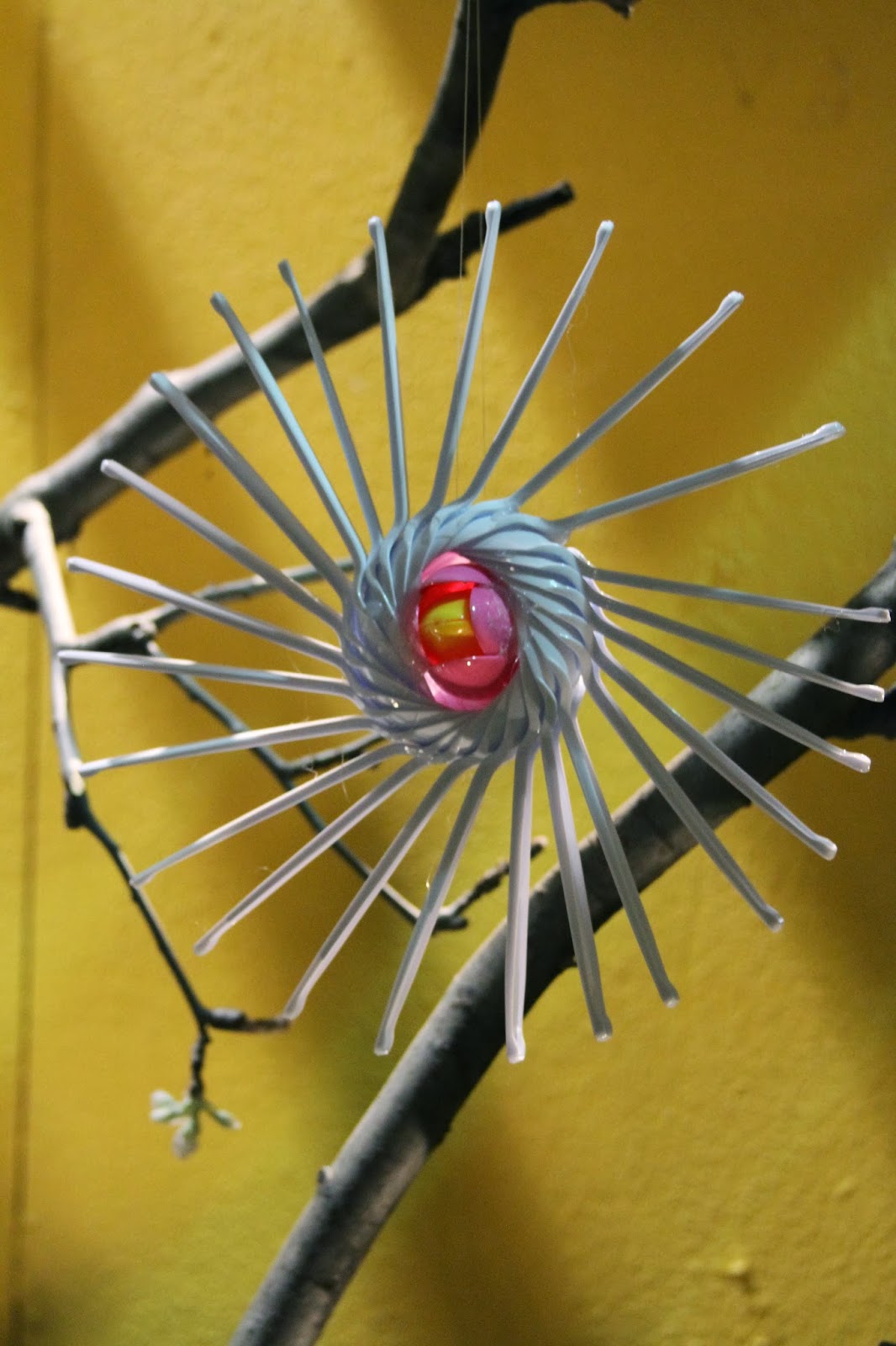
Inside were fantastic sculptures made of plastic spoons glued together (yes, those are spoons), glass bottles turned upside-down and used as herb borders, tire rims spray-painted and mounted as wall decorations, and too many other clever details to list. It was a showcase of young artistic and agricultural talent.
Right around the corner, though, amid signs with fabulous garden-equals-art quotes like
"Nothing is more the child of art than a garden" (Sir Walter Scott)and
"Gardening is the art that uses flowers and plants as paint, and the soil and sky as canvas" (Elizabeth Murray)I found the artwork of my dreams.
Part of a entertaining display of original art by a wide variety of artists for a series commissioned by the Hudson Valley Seed Library, it was the cover design for a pea seed packet.
Unfortunately I was unable to find the actual seed packets. I would have bought one (or a few) of this one to frame, forget about the seeds!
This was a stellar flower show. Most of the exhibitors picked up the theme and ran with it in unbelievably creative and unique ways. It was beautiful and thought-provoking and inspiring. Most of all it made you want to pick up a trowel and start planting...
Just as any good flower show should.


Cool article and pix. Thanks a lot!
ReplyDelete